3,895 search results
(0.018 seconds)
- Scrittura by Scholtz Fonts,
$12.50 Scrittura was inspired by Anton Scholtz’s font, Honeybird, and developed into a contemporary variation with three styles. Scrittura Moderna: sleek and calligraphic. A dramatic, vigorous yet elegant font, whose upright letter shapes flow into each other like molten gold. Use Moderna for marketing cosmetics and clothing, for book covers, greeting cards, wedding stationery. Scrittura Antiqua: weathered, almost grungy. A new font with an “antique” look , reminiscent of ancient parchment manuscripts. Use Antiqua for certificates, medieval banquet or wedding stationery, theatre posters and programs, and book covers. Scrittura Fantasia: magical and ghostly. A slightly distorted, evoking Halloween, the Day of the Dead, and your favorite horror movie. Use Fantasia for horror comic covers & posters, horror movie posters, CD covers, Halloween material. The font contains over 272 characters - (upper and lower case characters, punctuation, numerals, symbols and accented characters are present). It also includes "open-type"characters to enhance the flow of the text. It has all the accented characters used in the major European languages.
 - Scriptura by Sylvestre Studios,
$20.00A fluid font drawn by hand. - Escritura by Vanarchiv,
$30.00 The handwriting typeface Escritura was created for editorial purposes and the letter forms are influenced by chancery handwriting from the Italian Renaissance. The asymmetrical shapes of the undulating serifs cause the characters to have a large aperture. Originally designed for display sizes, the typeface also comes in a text version for small sizes. With taller vertical proportions, the text version has slightly longer serifs and increased white space between the characters to optimize legibility in small sizes. Ascenders and descenders and serifs are shorter in the display version, which has more economical letter spacing resulting in a visually compact text image. The stress in the letter strokes create changing widths according to their direction, improving the calligraphic rhythm in the characters. The oblique crossbar as well as other typographic details lend the typeface that typical Renaissance atmosphere.
 - Impossible - 500 - Unknown license

- 500 Guitars by Rocket Type,
$14.00 A chunky, whimsical number that strikes just the right chord for modern and retro projects. Loaded with stylistic alternatives, ligatures and Vietnamese support.
 - Escritura Hebrew by Vanarchiv,
$21.00 It was my first attempt to drawing a Hebrew alphabet to mach directly with other typeface (Latin) which I already designed. The Latin version is an handwriting display typeface influenced by chancery handwriting from the Italian Renaissance (broad-nib pen). One of the most typographic characteristic is there wavy forms, especially the serifs, where contains some of the main calligraphic references from this font family. The Hebrew script contain reverse contrast, the vertical proportions are more tall and the stroke weight is slightly more strong than latin lowercase to produce a correct visual balance between them, especially on small sizes (text proportions). This Hebrew square book-hand was influenced by Sephardic script style. The Latin characters contains interrupted strokes, the same was made for Hebrew letterforms to transpose correctly the same calligraphic approach between these two different alphabets.
 - Technical SCRIPTURE by MMC-TypEngine,
$19.00 ‘Technical Scripture’ 2015-2021 A manuscript look, Pixel labyrinthine Display Type System… Plus, an Optical “Layered Game”, Retro Futuristic Sci-Fi Digital interface evolving placeholder… Now with 3D Styles! It was designed as a pair to its brother font ‘Technical Signature’ a Small Caps Font, both inspired by antique Greek, mosaics zig-zag ornaments “ancient times computer” intentionally as a Romanic variation with same metrics... Searching for Technical Solutions, it resulted in many combined styles by matching the primary ones so there’s plenty variations for multi-purpose texting like layered typesetting or simply monochromatic designs… Plus got accurate streaming resolution, therefore some sub-families like Stamp and Texture implicates greater points for minimum size as Regular and Light is appropriated to Small Optical Text reductions. *The New 3’s Upgraded Edition Improvements consisted of Correct ‘Font Info’ (verified data-debugging) rescaled glyphs, quick design review, better style linking with correspondent renamed fonts, addition of automatic OT features encoding, 3D Styles and Italics. Ps. This actual Typeface was quickly re-edited for technical reasons and hasn’t yet reached the intended design, it will soon receive a more tangible redesign upgrade, mainly in lowercases to enhance cursive style. Due to other priorities. Tip: Give preference to THE LYSERGIC UPPERCASES! Multilanguage Support: Western & Eastern European, Baltic, Turkish, Greek, and Cyrillic. This Type is pleasant to Technician Compositions, Such as Briefs layouts manuscript, Old Engineering & Crafts Logos or Support Text, Op-Art Posters, Stamps, Labels, movies and Cartoons Ludic Scripts, sites and of course Video Games! Try ‘Technical Scripture’ & Have some Power to the Pixel! Padang!
 - Noble Criatura by pentagonistudio,
$19.00 Noble Criatura Is A Display Font Combinated with Sans/Serif Typefaces. SOFTWARE REQUIREMENTS : Fonts and alternate : No special software required they may be used in any basic program /website apps that allows standard fonts That's it folks! You can go ahead and get cracking :) Follow My Shop For Upcoming Updates Including Additional Glyphs And Language Support. And Please Message Me If You Want Your Language Included or If There Are Any Features or Glyph Requests, Feel Free to Send me A Message. Have a Good Day !
 - YD Myungjo 500 by Yoon Design,
$400.00
- William Page 500 by Wooden Type Fonts,
$15.00 A revival of one of the popular wooden type fonts of the 19th century, somewhat condensed, square.
 - YD Gothic 500 by Yoon Design,
$400.00
- Scritta Nuova by Anatoletype,
$16.00 Scritta Nuova was born to transpose my personal handwriting and evolved today into a smart typeface that maintains the original feel with improved legibility and visual balance. The steady rhythm and roundness of Scritta Nuova give the impression of a smooth, girlish and gentle writing. It also evokes retro calligraphic styles taught in Italian schools around the 1950s, which might have influenced in one way or another my original handwriting. Note that the capital letters can be nicely set next to each other without overlapping, unlike script typefaces with swashy capitals created as initials.
 - Rasgos Escritura Nuevos by Intellecta Design,
$16.00 a sort of decorative fleurons
 - Gans Rasgos Escritura by Intellecta Design,
$20.90 Gans Rasgos Escritura shapes (108 tails) was selected and freely interpreted from the vignettes catalog by Fundicion Gans published in 1920. You can combine these ornaments with your favorite fonts. We suggests the use of Pretoria Gross.
 - Museo 300 - 100% free

- lelim 200 - Personal use only

- lelim 300 - Personal use only

- Impossible - 050 - Unknown license

- Skylab 600 - Personal use only

- Egyptian 505 by Bitstream,
$29.99This face was designed by Andre Guertler’s class in room 505 at the Kuenstgewerbeschule in Basel. It follows the principles of Frutiger’s Egyptienne, and won the first of the VGC type competitions. - Caslon #540 by ITC,
$29.00The Englishman William Caslon punchcut many roman, italic, and non-Latin typefaces from 1720 until his death in 1766. At that time most types were being imported to England from Dutch sources, so Caslon was influenced by the characteristics of Dutch types. He did, however, achieve a level of craft that enabled his recognition as the first great English punchcutter. Caslon's roman became so popular that it was known as the script of kings, although on the other side of the political spectrum (and the ocean), the Americans used it for their Declaration of Independence in 1776. The original Caslon specimen sheets and punches have long provided a fertile source for the range of types bearing his name. Identifying characteristics of most Caslons include a cap A with a scooped-out apex; a cap C with two full serifs; and in the italic, a swashed lowercase v and w. Caslon's types have achieved legendary status among printers and typographers, and are considered safe, solid, and dependable. A few of the many interpretations from the early twentieth century were true to the source, as well as strong enough to last into the digital era. These include two from the American Type Founders Company, Caslon 540 and the slightly heavier Caslon #3. Both fonts are relatively wide, and come complete with small caps, Old style Figures, and italics. Caslon Open Face first appeared in 1915 from the Barnhart Bros & Spindler Foundry, and is not anything like the true Caslon types despite the name. It is intended exclusively for titles, headlines and initials, and looks elegant whether used with the more authentic Caslon types or by itself. - Zoo 300 by Green Type,
$37.00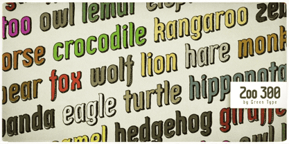
- Immi 505 by Adobe,
$29.00Immi 505 is another of Tim Donaldson�s prolific works. Inventive and fun-loving as always, Tim used a pen nib called a ?Brause 505? to create the letterforms for this design. The Brause 505 was an invention of Karlgeorg Hoefer. Hoefer created his typefaces Salto" and Saltino" with this nib. The other part of the name, Immi, is the nickname of Donaldson�s five-year-old daughter Imogen. The resulting unusual curves and open character of Immi 505 create a distinctive rhythm and color appropriate for short blocks of ad copy, titles, music CD covers, and Web page headlines where a bit of extra width is needed." - Egyptian 505 by URW Type Foundry,
$35.00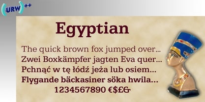
- Egyptian 505 by Linotype,
$40.99 - Caslon 540 by ParaType,
$30.00 The Bitstream version of Caslon 540 of the American Type Founders, 1902. Based on William Caslon I's first English Old Style typefaces of 1725. Caslon modeled his designs based on late 17th century Dutch types, but his artistic skills enabled him to improve those models, bringing a variety of forms and subtlety of details. Strokes in Caslon fonts are somewhat heavier than in earlier Old Style fonts, serifs are thicker and a bit stubby. Italic letters have uneven slope. A text set in Caslon looks legible and aesthetically appealing. Caslon is a favorite font of English printers for setting of classical literature. Cyrillic version was developed for ParaType in 2002 by Isay Slutsker and Manvel Shmavonyan.
 - Caslon #540 by Linotype,
$29.99The Englishman William Caslon punchcut many roman, italic, and non-Latin typefaces from 1720 until his death in 1766. At that time most types were being imported to England from Dutch sources, so Caslon was influenced by the characteristics of Dutch types. He did, however, achieve a level of craft that enabled his recognition as the first great English punchcutter. The original Caslon specimen sheets and punches have long provided a fertile source for the range of types bearing his name. Identifying characteristics of most Caslons include a cap A with a scooped-out apex; a cap C with two full serifs; and in the italic, a swashed lowercase v and w. A few of the many interpretations from the early twentieth century were true to the source, as well as strong enough to last into the digital era. These include two from the American Type Founders company, Caslon 540 and the slightly heavier Caslon #3. Both fonts are relatively wide, and come complete with small caps, old style figures, and italics. - Caslon 540 by URW Type Foundry,
$89.99 William Caslon (1692-1766) laid the foundation for English typefounding, when he cut his first roman face in London in 1722. He modeled his designs on late seventeenth-century Dutch types; thus his typefaces are classified as Old Styles. The original Caslon punches have been preserved, enabling a perfect recutting of his faces. Notice the hollow in the apex of A and the two full serifs or beaks in the C. The italic capitals are irregular in their inclination. The Caslon font family is distinctive for use in subheadings or continuous text.
 - Caslon 540 by Bitstream,
$29.99William Caslon’s design as made regular by ATF at the beginning of this century. - Roanne by Tour De Force,
$25.00 Roanne is a sans serif family named after a town in France. This font family contains 2 width variations: Normal and Condensed, and all together counts 44 font styles. Equipped with OpenType features (Tabular Figures, Fractions, Stylistic Alternates, Localization for Serbia, Poland and the Netherlands, Case Sensitive brackets) for extended Latin and Cyrillic character set with a small charming set of Dingbats. For easier usage as webfont, Roanne font files contain numeric values for CSS weight attribute – 100, 150, 200, 300, 400, 500, 600, 700, 800, 850, 900.
 - BN Niv 5000 - Unknown license

- Yoon Gothic 700 by Yoon Design,
$400.00 YD Gothic 700 is a modern sans serif typeface consisting of 9 weights. It supports up to 13 different languages such as English in Latin and other scripts
 - Base 900 Sans by Emigre,
$49.00
- Egyptian 505 SH by Scangraphic Digital Type Collection,
$26.00Since the release of these fonts most typefaces in the Scangraphic Type Collection appear in two versions. One is designed specifically for headline typesetting (SH: Scangraphic Headline Types) and one specifically for text typesetting (SB Scangraphic Bodytypes). The most obvious differentiation can be found in the spacing. That of the Bodytypes is adjusted for readability. That of the Headline Types is decidedly more narrow in order to do justice to the requirements of headline typesetting. The kerning tables, as well, have been individualized for each of these type varieties. In addition to the adjustment of spacing, there are also adjustments in the design. For the Bodytypes, fine spaces were created which prevented the smear effect on acute angles in small typesizes. For a number of Bodytypes, hairlines and serifs were thickened or the whole typeface was adjusted to meet the optical requirements for setting type in small sizes. For the German lower-case diacritical marks, all Headline Types complements contain alternative integrated accents which allow the compact setting of lower-case headlines. - YD Myungjo 200 by Yoon Design,
$400.00
- Egyptian 505 EF by Elsner+Flake,
$35.00 - Sequel 100 Black by OGJ Type Design,
$35.00 Sequel 100 Black is a neogrotesque font family for forceful headlines, confident titles, and striking posters. An extension of Sequel Sans and primarily designed for display use, it has wider proportions than the original typeface. It also sports a larger x-height that allows for maximum impact on the page. And Sequel 100 Black ain’t no lightweight: it’s the boldest member of the Sequel superfamily, with weights starting at 45 (a sturdy medium style) and going all the way up to an ultra-black 115. Use Sequel 100 Black whenever you want to combine a touch of cool mid-century modernism with the scintillating tension of maximum ink use and minimal whitespace.
 - MPI No. 510 by mpressInteractive,
$5.00 No. 510 is a friendly, slim gothic face. Strokes have a gentle inward curve at the median with the tops and bottoms of the letters slightly wider and thicker. The design was first introduced by William H. Page & Company around 1887.
 - Yoon Magazine 700 by Yoon Design,
$49.00 - Egyptian 505 SB by Scangraphic Digital Type Collection,
$26.00Since the release of these fonts most typefaces in the Scangraphic Type Collection appear in two versions. One is designed specifically for headline typesetting (SH: Scangraphic Headline Types) and one specifically for text typesetting (SB Scangraphic Bodytypes). The most obvious differentiation can be found in the spacing. That of the Bodytypes is adjusted for readability. That of the Headline Types is decidedly more narrow in order to do justice to the requirements of headline typesetting. The kerning tables, as well, have been individualized for each of these type varieties. In addition to the adjustment of spacing, there are also adjustments in the design. For the Bodytypes, fine spaces were created which prevented the smear effect on acute angles in small typesizes. For a number of Bodytypes, hairlines and serifs were thickened or the whole typeface was adjusted to meet the optical requirements for setting type in small sizes. For the German lower-case diacritical marks, all Headline Types complements contain alternative integrated accents which allow the compact setting of lower-case headlines.


Page 1 of 98Next page